I built a expense tracker app, what started as a weekend project, took me two years to release. You can try out the app at xpns.fun

1. Introduction & Motivation
Two years ago, I embarked on a quest to gain control over my spending. With aspirations to save and invest, I realized the need to track and categorize my expenses. This practice not only optimized my spending habits but also paved the way to create a tool that I believed many could benefit from.
2. Discovering the Need
My introduction to ember.js began when I joined a new company. As I delved deeper into the framework, I spotted an opportunity to combine my newfound knowledge with my personal need for expense tracking.
3. Excel Sheet Management: The Initial Blueprint
My first foray into expense tracking was through Excel. I utilized formulas to:
- Sum expenses by category.
- Visualize these expenses using pie charts.
- Calculate the budget used versus the number of days remaining in a month.
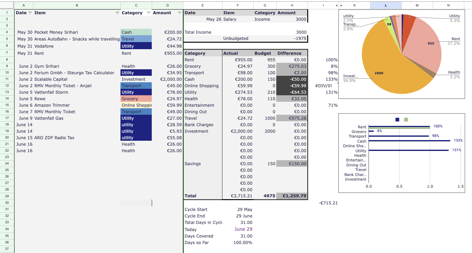
This excel-based system became a muse, sparking a playful thought: “If there’s an excel sheet that solves your problem – it might just be a million-dollar SAAS app.” (Okay, I jest, but dream big, right?)
4. The Ember.js Learning Curve
The official Ember JS website, coupled with some incredibly supportive peers, helped me navigate the challenges of learning Ember.js. However, wading through outdated documentation from older Ember versions was a maze in itself.
5. Milestones & Progress
Every project has its highs and lows. Some of the high points included:
- Seamlessly integrating Google login using ember-simple-auth.
- Implementing mirage to mock API requests in the absence of an actual API.
- Swift deployment of a Rails backend.
Setbacks? Yes, those were aplenty. From Heroku dropping their free plan (leading me to switch to fly.io) to a temporary loss of interest, the journey was anything but smooth.
6. Key Features & Comparisons
Inspired by the excelsheet that gave me a quick glance to everything needed, I modelled the dashboard after it.
It has a three column layout in large screens, in mobile devices, you see one column at a time.
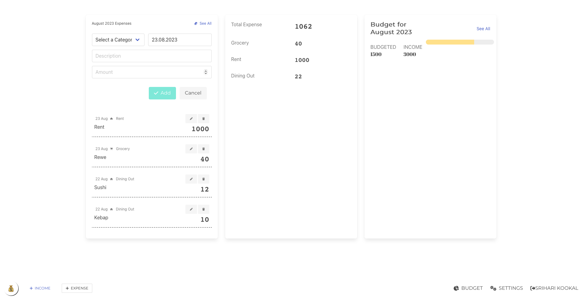
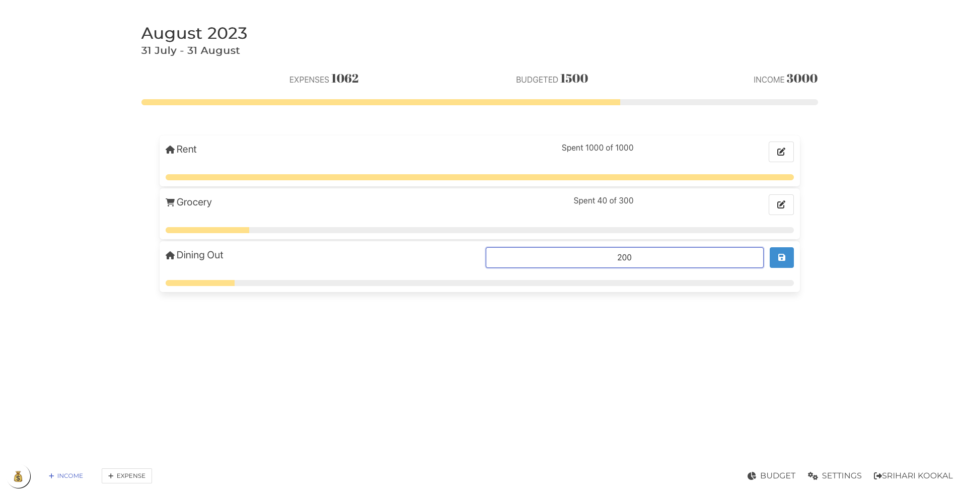
Budgets are supposed to be set once in a while, and then to be followed. So I moved it out to a seperate page, a click away from the dashboard:
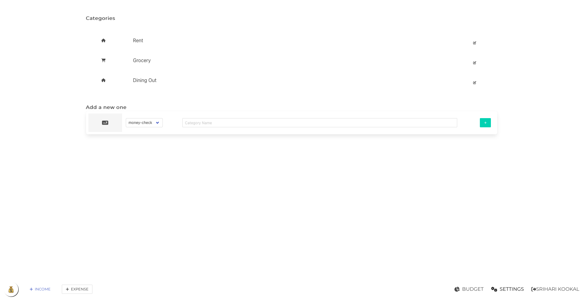
The categories shown when expenses are added can be edited from the settings page:
The UI is responsive and perfectly usable on devices like the iPhone 12. One thing to note: while the app is streamlined, it doesn’t yet have the graphs and visualizations that my Excel sheet boasts.
7. Challenges Faced & Overcome
Apart from the technicalities, the greatest challenge was convincing its first user (yours truly) to transition from the trusted Excel sheet to xpns.fun.
8. Feedback & Iterations
My primary beta tester, my wife, candidly labeled the app as ‘buggy’. This feedback, while disheartening, was valuable. I chose to refine the app further before seeking more feedback.
9. The Present State of xpns.fun
Currently, xpns.fun has a grand total of zero active users. While I did manage to get three friends to sign up, none of us have truly transitioned to using it.
10. Future Plans & Roadmap
My aspirations for xpns.fun? To monetize it and revel in the millionaire dream.
11. Conclusion
Two years and countless hours later, if there’s one piece of advice I’d give to anyone embarking on a similar journey, it’s this: Embrace the process. The destination might not always be the glittering prize you imagined, but the journey is worth every second.
12. Acknowledgments
A big shoutout to the Ember.js community for their unwavering support. Immense gratitude to my friends for their patience. And, echoing the words of Snoop Dogg:
Last but not least, I wanna thank me For believing in me, For all the hard work and the days with no rest. For never giving up, for being the best.